
About the article
This article is intended for developers with an experience in website layout and knowledge of HTML and CSS, who understand the purpose of CSS selectors, etc.
In this article, types of layouts are considered, that allow displaying sites correctly on any resolution, their implementation methods. Let’s consider the concept of CSS framework and make a comparative analysis of the most popular ones.
Layouts types
In this paragraph the main types of layout, their differences and basic principles using in their implementing are considered.
Fixed layout
Fixed Layout is an approach to create site pages with a given width. The width of the components on the page does not change. A horizontal scroll bar appears on monitors with a small resolution. This type of layout is not suitable for convenient displaying information on mobile devices.
An example of a strict width specification for the body tag is demonstrated below:

Elastic layout
Elastic layout means the ability of the site components to change their sizes depending on the size of the browser window, to stretch from the specified minimum to the specified maximum. It was achieved by using relative values, max-width / min-width (maximum / minimum width), max-height / min-height (maximum / minimum height).
Using of elastic layout method examples:


Adaptive Layout
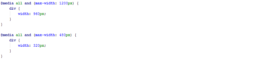
Adaptive Layout allows adjusting the main container and any other elements of the site to the screen resolution, making it possible to change a font size, objects location, color, etc. It happens dynamically, for example, using media requests (@media). It allows determining automatically the monitor resolution, the device type and substitute the specified values in automatic mode. In the example below, the equal to 960px div width is set for all devices that are less than 1200px and 320px is set for all devices that are less than 480px wide.

Responsive Layout
Responsive Layout is a combination of rubber and adaptive layout. In this approach, both media requests and percentages of the component width are used. Using this type of layout, the site will certainly adapt to any device.
Below, the width of div is equal to 50% of the parent component size for all devices. If the width is less than 1200px and 100% for all devices with width less than 480px.

Basic methods of implementing sites for any screen resolution
Relative values
Using relative values allows displaying information and components on the page without losing readability and viewing convenience.
Relative values for sizes and indents
Relative values can be specified for width, height, margin, padding, etc. The most well-known way to specify a relative size is to do this in percentages (%).
Below, there is an example of setting a width equal to 90% of the size of the parent component.

The value is calculated according to the parent component. Also, there are values relative to the screen size:
- vw – 1% of the window width. When the width of the window decreases, the width, height, and font of the element decreases;
- vh – 1% of the window height. As the window height decreases, the width, height, and font of the element decreases;
- vmin – the smallest vw and vh is selected;
- vmax – the largest of vw and vh is selected.
An example of using vw and vh is written below. In this case, the width and height of the div tag is equal to 50% of the width and height of the screen, respectively.

Relative values for the font size
There are the following relative values for fonts:
- em – sets the size relative to the parent font;
- rem – sets the size relative to the <html> font.
Let’s consider an example:

Let’s calculate the font size for body tag. In this example, the font size for the body is set according to the html size. Thus, the font size for the body is 30px (20px*1.5=30px).
Also, relative font sizes can be set using %, vw, vh, etc. In the following example, the font size for the body is 80% of the html font size and equal to 16px.

Maximum and minimum component sizes
To set the maximum and minimum values for the width and height of the component, the properties max-width/min-width and max-height/min-height are used.
Let’s consider an example:

Assume that the parent component of this div is body. Then, if you change the width of the screen, the width of this component will be 60% of the body width. However, it will increase only to the value specified in max-width, this is 500px. As soon as the container reaches this width, it will stop increasing.
Using media requests
Media requests allow setting styles for a specific screen size or device type basing on the characteristics of the device, etc. All media requests start with @media, then the condition follows.
Using media requests, styles can be specified for the following types of devices:
- all – all types (the default value)
- braille – devices based on the Braille system, which are designed for reading by blind people
- embossed – printers for printing the braille system
- handheld – smartphones and similar devices
- print – printers and other printing devices
- projection – projectors
- screen – monitor screen
- speech – speech synthesizers, as well as programs for playing texts out loud
- tty – devices with fixed size characters
- tv – TV sets.
An example of setting the width for a div tag, on monitors screens, smartphones, etc

CSS frameworks
CSS framework is designed to simplify the work of a layout designer, to speed up development and to eliminate the maximum possible number of layout errors (compatibility issues of different browsers versions , etc.). These frameworks are used for sites creation and displaying them on different devices.
Many developers prefer using CSS frameworks, instead of prescribing all styles manually, and here are the main reasons:
- Faster development
- Cross-browser support
- Support of different devices and screen sizes
- Uniformity of code when working in a team reduces the number of disagreements in development.
As libraries of scripting languages, CSS libraries, usually have an appearance of an external CSS file, and are added to the title of the web page.
Let’s consider the most popular CSS frameworks.
 http://getbootstrap.com/
The most popular framework for the development of adaptive and mobile web projects. Bootstrap is an open source tool for developing websites using HTML, CSS and JS. Bootstrap is intuitively simple and at the same time powerful interface framework, that speeds up and facilitates web applications development.
Bootstrap scales your project easily and effectively with a single code base: from phones and tablets to desktop computers. The 12 column grid is used for this:

In addition to CSS, this framework includes support of the two most popular CSS preprocessors: Less and Sass.
Distinguishing features:
- 12 column grid
- A large number of ready-to-use components
- Support of Less and Sass
- Usage of Normalize.css.
Material Design for Bootstrap
Material Design for Bootstrap is an open source application development toolkit. It is based on Bootstrap and uses Material Design approaches.
The framework allows a developer to create quickly an application using Sass variables, adaptive mesh, a large number of ready-made components and powerful plugins, implemented in jQuery.
Distinguishing features:
- 12 column grid
- A large number of ready-to-use components in accordance with the Material Design concept.
Materialize
Official website:
http://materializecss.com/
Materialize is a modern, adaptive platform built on the principle of material design. The platform includes a set of components, as well as styles for them. Animations and effects in components are worked out so that they are as smooth as possible. All elements and animations are intuitive and user-friendly, and a single adaptive design simplifies UX for all platforms.
Distinguishing features:
- 12 column grid
- A large number of ready-to-use components in accordance with the Material Design concept
- Support of Sass.
Bulma
Official website:
http://bulma.io/
Bulma is a modern CSS framework based on the new Flexbox display method. Flexbox is the most advanced layout tool, that is available in CSS.
Distinguishing features:
- Usage of Flexbox instead of a column grid
- A large number of ready-to-use components
- Support of Sass
- JS files are not used.
Pure
Official website:
https://purecss.io/
Pure is a set of small adaptive CSS modules that can be used in any web project. Pure is built on Normalize.css and provides markup and styles for own HTML elements, as well as the most common user interface components. Pure is an adaptive framework, so the elements look great on all screen sizes. Pure has minimal styles, which means an opportunity to write customized styles.
Distinguishing features:
- 24 column grid
- Modular framework
- JS files are not used
- Normalize.css is used
- The minimum number of ready-made components and styles.
Conclusion
The rapid growth of the popularity of browsing sites on mobile devices requires the implementation of a convenient and readable displaying components, regardless of device types and screen sizes. The approaches considered in this article help to create sites for different devices and screen sizes. The description of CSS frameworks simplifies the choice of a suitable framework for using it in the project.
–>